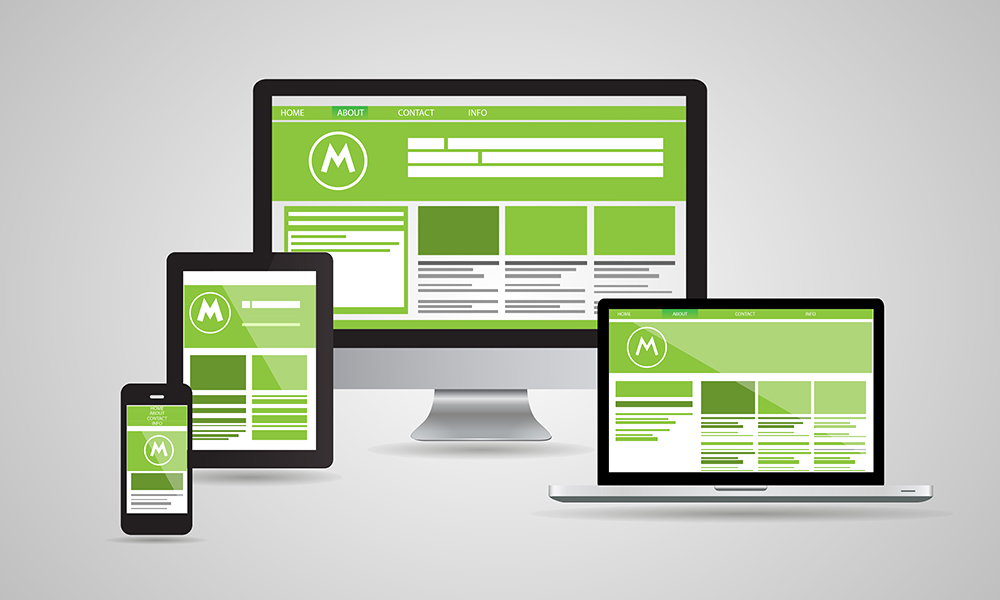
Specific access to the modern web design is the so-called responsive web design (responsive web design or abbreviated RWD).
The term responsive web design implies the creation of Internet content that is first and foremost easy to use, but also extremely suitable for use on different types of devices having different screen sizes.
Responsive web design is a specific technique for creating a particular site that is, as its name suggests, flexible for displaying. This responsiveness primarily refers to screens of different sizes, and in this way, the site that was created by this technique can be easily viewed on desktop computers and on laptops, tablets and mobile phones, which have different screen sizes and the content is equally transparent on each of the above devices.
The content of the site that is made by the responsive web design technique is fully adapted to different screen sizes using the so-called fluid grids (which are based exactly on an adequate proportion), as well as using flexible images and special technology which allows different CSS properties to be equally well-used on devices with different screen widths (CSS3 media queries).
The basic characteristics of responsive web design on mobile phones, besides listed are JavaScript codes, which are unobtrusive, as well as progressive improvement. This actually means that some mobile phone models or their browsers do not actually understand JavaScript codes.
For this reason, it is recommended that you first create a very simple web page that, with adequate corrections, is very carefully and gradually adjusted, that is, improved according to the needs of all models of mobile phones, or desktop computers, laptops, and tablets. With the fluid grid system, it is very important that it is necessary that the dimensions of all the elements of a particular page are not expressed in pixels (absolute unit), as is usually the case, but in percentages (relative unit). This applies, of course, to photographs, for which it is also necessary to be expressed in percentages, as this prevents the possibility of photographs being displayed outside the content of a certain element in which they are located, or as it is said in a jargon, not to dissipate the site. The term CSS media queries implies the use of different CSS styles, in accordance with the different dimensions of the devices intended to display a particular website. In this way, we adjust, let's say, the margins or the size of the letters within the text, in order to achieve optimum visibility of web content on devices of different dimensions.
When it comes to the need for a particular website to be visible on mobile devices, even when they do not recognize JavaScript, or do not support JavaScript codes, it is necessary to perform a detection of the search engine in the first place, but also of the mobile device itself. In this way, it becomes known whether a particular mobile device supports the properties of HTML or SCC or not. And in order for these methods to be truly reliable, it is necessary to combine them adequately with the possibilities offered by the Database.
In the absence of support for certain devices, that is, if they do not support HTML and CSS properties, there are many Internet tools available to enable that support. It should be borne in mind that each of the above check functions is not completely reliable for detection. Luckily, various add-ons are available today in web browsers which offer quick and easy testing of responsiveness.